What to Include in Your Company Letterhead
In this modern age, where most communication is electronic and paper mail is mostly advertisements, you may reasonably ask, “Who the heck writes letters anymore?” (Or perhaps, “What the heck is a letter?”) You may, therefore, be excused for not knowing what “letterhead” is, what it’s for, or how to design a good one.
(For those too young to remember: Letterhead is a business’s custom pre-printed stationery. Before personal computers were common, when a company wanted to communicate with the outside world, someone would grab a sheet of the company’s letterhead, put it in a typewriter, and type out a letter, which would be placed in a matching envelope, sealed, stamped, and put in the mail.)
So, why would anyone care about letterhead anymore, much less spend money to have some printed up? Because there are still occasions when sending messages on paper is advantageous (and sometimes even required), and your letterhead is a component of your brand image. A well-designed letterhead, printed professionally on premium paper, is a way of saying, “I care about quality in every aspect of my business.”
Designing Effective Letterhead
Here are some things to consider when designing your letterhead:
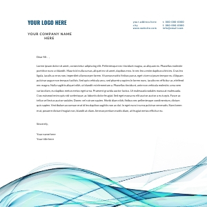
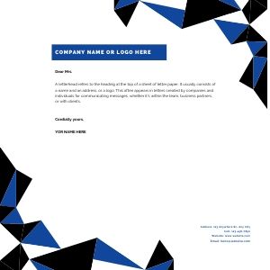
- The basics: Who you are, where you are, and how to get in touch with you–that is, the same stuff you’d put on a business card: company name, logo, physical address, email, phone, fax, and web address, and perhaps a tagline.
- Beyond the basics: Other ways to keep in touch, such as Facebook, Twitter, or Skype.
- Standard industry practices: You could stop with the necessary information about your communication channels, but in specific industries, it’s common to include additional design elements. A medical clinic might list the names of the doctors in practice. A law firm might list the names of the partners. Some charitable organizations list significant donors or sponsors or the names of their directors.
- Don’t go crazy: It’s easy to get carried away when designing a letterhead. Just remember that the purpose is a meaningful platform for sending written communication. This means you need to leave room for the content, and the visual design of the letterhead should not distract the recipient from the content. Keep it simple and keep it usable.
- Color or no color: Color is usually good—it says, “I cared enough about my image to show I didn’t just print this on my office laser printer.” Just don’t go overboard; your logo and one or two other places are probably all the colors you need.
- Fancy add-ons: There was a time when raised lettering, cutouts, expensive linen paper, and custom watermarks were essential, but considering the limited applications for which you will use letterhead, these are probably no longer worth the extra money.
Some final thoughts: Unless you know you are going to make extensive use of your letterhead, don’t buy a ton of it. All it takes is one change, such as your physical address or a phone number, to render your letterhead useless. This is another argument for keeping it simple; the more information you put on your letterhead, the more likely it is that something will change before you use all of it.
Of course, you could use the backside for scratch paper, but who uses scratch paper anymore?
Download a FREE Letterhead Template
Want something unique for your letterhead?
Our GraphicscTeam is here to bring your vision to life.